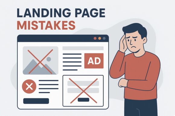
Mobile traffic isn’t just a side note—it’s a huge part of how folks engage with content today. With so many people reaching for their phones to browse the web, overlooking mobile optimization is like shutting out a massive, eager audience right at the gate.
A major mistake is treating mobile users as an afterthought. This often leads to navigation woes, tiny text, and forms that are frustrating to fill out on smaller screens. When a visitor struggles to interact with your page, they’re fairly likely to leave in annoyance. That’s the harsh truth of a poorly optimized mobile experience.
So, what’s the fix? Adopting a mobile-first design approach can turn things around. It starts with ensuring your responsive design is smooth and slick. That means big, easy-to-click buttons, concise but meaningful content, and images that don’t take forever and a day to load. Testing your page on various devices is also crucial—don’t assume one size fits all when it comes to screens.
Remember, every visit is an opportunity, especially with mobile users often searching on the go, looking for quick and easy solutions. By optimizing for their needs, you not only keep them on the page but guide them gently towards that all-important conversion.
Overwhelming Visitors: The Dangers of Cluttered Design
A cluttered design can confuse visitors more than it helps. When people land on your page, they’re looking for a quick understanding of what you’re offering. Throw too many elements in without rhyme or reason, and you risk losing their attention.
Clutter is often the result of trying to say too much at once. This might show up as too many images, blocks of text, or various CTAs all vying for attention. Instead of enticing visitors to explore further, a messy page can make them bolt for the exit.
The remedy is in simplicity. Start by identifying what’s essential and what can be trimmed away. Use clear, concise content that gets straight to the point. The use of white space can make a big difference, offering a visual breather and highlighting key elements without overwhelming the senses.
Arranging information in a way that’s logical and easy to follow is like giving your visitors a map. Whether it’s a well-organized menu or a straightforward layout, clarity guides users effortlessly toward where you want them to go. This straightforwardness isn’t just about aesthetics—it’s crucial for keeping visitors engaged and informed.
By embracing a minimalist design, you’re crafting a visually appealing, easy-to-navigate environment. It’s about making every piece of content work harder and serve a purpose. Get this right, and your visitors will feel more relaxed and willing to stick around, engaging with what your page has to offer.
Ignoring the Power of Clear Call-to-Actions (CTAs)
Call-to-actions (CTAs) are the heart of any landing page, guiding visitors toward taking that vital next step. When CTAs aren’t clear or are buried under a pile of content, you’re leaving potential conversions on the table. Visitors need to know exactly what they’re expected to do without hesitation.
A common mishap is having vague CTAs. Phrases like ‘click here’ or ‘submit’ don’t really tell the visitor what action they’re taking or the benefit of doing so. Instead, CTAs should be straightforward and emphasize what the user will gain. ‘Get Your Free eBook’ or ‘Start Your Free Trial’ offers visitors a clear direction and benefit.
Equally important is the placement and design of your CTAs. They should catch the eye but not in a way that disrupts the user experience. Consistent styling, with bold colors and clear fonts, helps them stand out. Consider their location on the page too. If a CTA requires scrolling through heaps of information, it might get lost in the shuffle.
Look at your CTAs as guideposts—marking the path you want your visitors to travel. Testing different wording, colors, and placements through A/B testing can offer valuable insights into what resonates best with your audience.
Crafting CTAs is an art of subtle persuasion. Remember, a well-designed CTA doesn’t just inform; it encourages and motivates visitors to take that step towards conversion. Implementing these effectively can dramatically enhance the impact of your landing page.
Bypassing User Intent: Aligning Content with User Expectations
Understanding what visitors want when they land on your page can make or break the success of your landing efforts. Failing to address user intent means you risk creating content that feels out of touch or offers little value, pushing potential leads away.
User intent isn’t just a buzzword—it’s about meeting visitors where they are in their journey. Sometimes content misses the mark by being too product-focused, ignoring what the visitor is actually looking to solve or learn. Visitors may come seeking information, comparisons, or a specific service, and your content needs to reflect their needs.
A good starting point is analyzing data from user behavior and feedback. Investigating which keywords and queries bring people to your page can give you insight into their intent.
Aligning content with user expectations involves more than just tweaking headlines; it means delivering value that matches the visitor’s stage in the decision-making process. For example, a customer seeking a guide shouldn’t be met with a hard sales pitch. Instead, offer educational content and build trust.
It’s important to continually assess and refine the match between your content and user expectations through testing and adjustment. By doing this, you enhance the user experience and improve the chances that visitors stick around, explore more, and move toward conversion.
Underestimating Page Load Speed: Every Millisecond Matters
Page load speed is more than a technical tweak; it directly affects how visitors perceive your site and whether they decide to stick around. Slow load times can frustrate visitors, causing them to abandon your page before it’s even fully loaded.
The connection between load speed and conversion rates is undeniable. Users expect quick responses and seamless experiences, otherwise, they’re inclined to move on to a faster competitor. It’s one of those areas where every second really counts.
Identifying page load issues often requires a deep dive into your site’s performance data. Tools like Google PageSpeed Insights or GTmetrix can help pinpoint what’s bogging down your load times, whether that’s unoptimized images or too many redirects.
Once you figure out the culprits, there are several best practices to speed things up. Consider compressing images, leveraging browser caching, and minimizing CSS and JavaScript files. Streamlining elements like scripts and plugins helps, too.
Ongoing monitoring is crucial. Regular checks ensure your site maintains its performance standards and adapts to the evolving digital landscape. Fast-loading pages not only enhance user satisfaction but also improve your SEO rankings.
Ultimately, a zippy load time enhances the overall user experience, making visitors more likely to engage with your content and move toward conversion. It’s a vital investment in the effectiveness of your landing page.
Lacking Trust Signals: Building Confidence with Visitors
When visitors hit your page, their gut instinct plays a big role in whether they engage or bounce. This instinct is hugely influenced by how much they trust what they see.
Trust isn’t built on flashy design alone. It’s the subtle cues and signals that reassure visitors they’re in the right place. Missing these trust elements can raise doubts about your credibility and reliability right off the bat.
Important trust signals include clear contact information and visible privacy policies. But more than that, consider using testimonials and reviews. Real feedback from real people can be incredibly persuasive.
Social proof—like case studies and user stories—shows visitors that others like them have successfully used your product or service. It’s a powerful way to build rapport without saying a word.
Also, don’t forget security signals. Displaying secure payment icons or trust seals at critical junctures reassures users their sensitive information is safe. It’s an essential peace of mind factor in the digital age.
Incorporating these elements seamlessly into your page confirms to visitors that you’re credible. It’s about building a relationship from the get-go so they feel confident in taking that next step with you.
Conclusion: Refining Your Landing Page for Maximum Impact
Having walked through common pitfalls, it’s vital to remember that creating an effective landing page is an ongoing journey. Constantly refining your approach according to visitor behavior and preferences ensures your page stays relevant and impactful.
Regular testing isn’t optional. A/B tests allow you to understand what works and what doesn’t. This insight is invaluable for making informed adjustments that keep your page performing at its best.
Don’t shy away from making bold changes where needed. Sometimes what seemed like a minor issue can turn into a major conversion rate booster when tackled effectively.
Every landing page is a living entity, reflecting your brand’s commitment to meeting visitor needs head-on. Keep adapting and iterating, and you’re more likely to see your landing pages become powerful tools for engagement and conversion.


2 Comments
Excellent breakdown of the most common (and costly) landing page mistakes. I’d like to add a “+1” to the section on “Bypassing User Intent.” This is the silent killer of conversions.
One framework I find helpful is categorizing intent as:
Informational (I want to learn)
Commercial Investigation (I’m comparing options)
Transactional (I’m ready to buy)
Aligning the headline, content, and CTA with that specific intent is everything. A visitor with “informational intent” will be scared off by an immediate “Buy Now!” button, while a “transactional” visitor just wants a clear path to purchase. Great article for emphasizing this crucial alignment.
Regards
Oren
Thanks so much, Oren — that’s a fantastic addition. I really like how you broke down intent into those three categories; it makes the concept much more actionable. You’re absolutely right: when the message and CTA don’t match where the visitor is in their journey, it creates unnecessary friction (and lost conversions).
Your example of an informational visitor getting pushed into a hard sell is spot on — that mismatch is one of the quickest ways to lose trust. On the flip side, meeting transactional intent with clarity and simplicity can feel almost effortless for the user.
Really appreciate you sharing this framework — it’s a great way to approach alignment in practice.