Color psychology is all about understanding how colors can influence human emotions and behavior. It’s like the science of how we feel when we see different colors, and it plays a massive role in how we interact with brands, marketing materials, and digital interfaces. It’s important because
Different colors can spark different emotions and perceptions. For example, blues often evoke feelings of trust and calm, while reds might trigger excitement or urgency. This idea has been rooted for quite some time in the world of marketing and design, where color choice could make or break the effectiveness of a campaign.
Historically, marketers have used colors strategically to influence consumer behavior and boost sales. Think about legendary brands like Coca-Cola using red to create a sense of urgency or excitement, or how banks often use blue or green to cr
eate feelings of stability and trust.
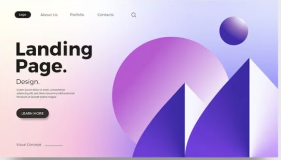
In today’s digital world, color psychology is being used more than ever to enhance user experience on websites and apps. On landing pages, selecting the right colors can lead to higher user engagement and better conversion rates. So understanding the basics of color psychology isn’t just a bonus; it’s a necessity for anyone working in design or digital marketing.
The Science Behind Color Perception
Color perception isn’t just in our heads. It’s a fascinating intersection of biology and psychology that explains why colors influence us the way they do. When we see colors, light receptors in our eyes send messages to the brain, which then interprets these signals into the various hues we perceive. It’s like a biological process turned into art in our minds.
Science backs up the theory that colors can affect moods, with plenty of research underlining this link. Studies show how blue light affects melatonin production, influencing our sleep patterns. Another example is how red can increase heart rates, fueling excitement or warning.
Cultural background also plays a critical part in how we respond to colors. While white symbolizes purity in some cultures, it represents mourning in others. This means understanding your audience’s cultural context is key when picking colors for a global audience or even a diverse demographic.
The color spectrum itself is an influencer of emotional responses. Bright, warm colors like red and orange are often exciting or agitating. In contrast, calmer tones like blue and green promote relaxation and peace. Each spectrum part can uniquely shape user interactions, making informed color decisions vital for any designer or marketer.
Applying Color Psychology to Landing Pages
Landing pages rely heavily on first impressions, and color plays a pivotal role in ensuring those impressions are positive. Choosing the right colors can make users feel welcomed or intrigued, promoting deeper interaction with the content. Ignore color, and you might put off potential users before they’ve even begun exploring your message.
Color’s influence on user experience (UX) cannot be overstated. It can direct attention,
evoke emotions, and even guide decision-making. For instance, bright colors are often used for call-to-action (CTA) buttons to grab attention and encourage clicks. At the same time, softer tones might be used in backgrounds to create a serene, easy-on-the-eyes environment.
Case studies reveal how choosing the proper color combinations on landing pages can significantly impact conversion rates. For example, many brands have found success by reassessing their color choices, resulting in noticeable increases in user interaction and completed actions like sign-ups or purchases.
However, it’s easy to make mistakes with color. Choosing hues that clash or are too overwhelming can lead to a poor user experience and drive users away. Ensuring that there’s a harmony between colors used in text, backgrounds, and interactive elements helps in maintaining visual appeal and functionality. Understanding these principles and applying them carefully ensures that your landing page isn’t just visually pleasing but also effective.
Choosing the Right Color Palette for Your Audience
Identifying your target audience’s preferences is the first step in choosing the right color palette. Knowing who you’re talking to lets you tailor your design to their tastes and emotional triggers. This means conducting research to understand demographic details, cultural backgrounds, and even psychological profiles.
There are various tools and techniques to help select the perfect colors, such as color psychology guides and color wheel tools. These tools can help create harmonious color combinations that appeal to your target audience. Checking out trend reports can also offer insight into what’s visually appealing to particular demographics at any given time.
Balancing brand consistency with user expectations requires creativity and strategy. While it’s essential to maintain your brand’s established color guidelines, adapting them for a landing page necessitates aligning those colors with customer expectations to foster engagement and trust.
Different digital platforms might demand varied color applications. A website’s optimal palette mig
ht not work for a mobile app due to screen differences and usage contexts. Understanding the nuances of each platform and how users interact with them ensures that the color scheme is functional and visually appropriate across all touchpoints.
Integrating Color with UX and Brand Identity
Aligning your color choices with your brand’s identity and message is essential in maintaining a consistent and recognizable presence. The colors you choose should reflect your brand’s personality, values, and promises. This calls for tight coordination between design and branding teams to ensure visual and messaging harmony.
Colors don’t work alone; they’re part of a bigger design symphony that includes typography, imagery, and layout. A cohesive design effectively combines these elements, where each color complements the overall aesthetic. This synergy enhances user engagement, ensuring that the visual journey feels planned and polished.
A/B testing is invaluable for optimizing color strategies. By testing different hues for buttons, banners, or backgrounds, you can pinpoint which colors drive engagement or conversions most effectively. Continuous testing and tweaking allow for data-driven decisions that support your design goals and improve user experience.
Practical tips for designers include ensuring accessibility in color choices. This means considering color contrast for readability and catering to users with color vision deficiencies. Giving everyone an equal chance to connect with your content is not just ethical; it’s smart design.
Integrating color thoughtfully across all branding and UX facets ultimately creates a seamless, inclusive, and emotionally resonant experience. Taking deliberate steps in this direction ensures that your audience feels not just accommodated, but genuinely understood.
Practical Insights and Future Trends in Color Use
Exploring the current trends in digital color use gives a fresh perspective on modern designs. Recently, there has been a noticeable shift towards bolder, more vibrant colors in web and app design to capture user attention in an increasingly visual culture.
Advanced technology plays a pivotal role in color personalization, offering opportunities to tailor designs based on user preferences and behaviors. Algorithms can adapt color schemes in real-time, crafting unique experiences for each visitor.
Emerging tools employing artificial intelligence and machine learning are expected to push the boundaries of color use, offering creators more dynamic and adaptive design options than ever before. This opens up a world of possibilities for pe
rsonalizing user interactions to an unprecedented degree.
For designers and marketers, understanding these trends is crucial for staying competitive. Being proactive about changes in user preferences and technological advances keeps your designs relevant and effective.
At the heart of it all, successful color application stems from a deep understanding of both the art and science behind it. Designers who take note of these insights and trends will forge stronger connections with their audiences, crafting experiences that are as visually appealing as they are emotionally engaging.


2 Comments
Hey, I like this post. I’ve always believed color isn’t just decoration, but it’s communication. Back when I first built my website, I didn’t think much about color psychology until I realized why people stayed longer on some pages and bounced faster on others. The colors were either inviting or intimidating. That’s when I learned that design is really emotional language in visual form.
Your breakdown of cultural influence resonated me, especially as someone from South Sudan where white and red carry very different meanings than in the West. It reminds me that digital design isn’t “one size fits all.” A color that means peace in one culture might mean grief in another.
I’m curious though. Do you think AI tools will ever understand context deeply enough to suggest color palettes based on cultural psychology, not just aesthetics? That would be next-level helpful for global creators like me who serve diverse audiences.
Either way, this piece is a solid reminder that when you design with feeling, you connect with humans, not just users. Let me know if you have an answer to my questions.
John
Hey John, I really appreciate your comment — you captured exactly what I was hoping to highlight! You’re absolutely right — color goes far beyond aesthetics; it’s a form of emotional and cultural storytelling. Your experience with your website is such a great example of how subtle visual cues can shape how people feel and behave.
And yes, your point about cultural context is so important. What feels calming or celebratory in one culture can carry the opposite meaning elsewhere, which is why designers need cultural empathy just as much as creative skill.
As for your question, I think we’re heading in that direction. AI tools are getting better at understanding context through data on user demographics, regional trends, and even emotional tone. The real breakthrough will be when they can interpret cultural nuance — not just color theory — and adapt palettes based on deeper psychological and symbolic meanings. That’s when design will truly become globally intuitive.
Thanks again for sharing your perspective — voices like yours make these discussions richer.