Optimizing a website for conversion can be one of the best ways to turn traffic into real results.
Whether I’m selling a product, offering a service, or looking to collect leads, focusing on website optimization for conversion means making every visitor’s adventure as smooth and effective as possible. As someone who has worked on dozens of websites across different industries, I’ve seen how a few smart tweaks really boost conversion rates. Here, I’ll walk you through the key strategies and techniques that help improve website conversion, so you can get more out of the efforts you’ve already put into bringing traffic to your site.
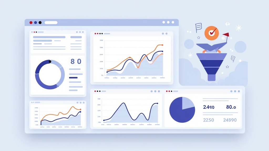
Understanding Website Conversion Optimization
Conversion optimization is all about encouraging visitors to take a specific action I want them to, like making a purchase, filling out a contact form, or subscribing to a newsletter. To do this well, I need to have a clear goal for each website or even each page. Every part of the site should support that goal.
Even if my site attracts thousands of visitors, that volume means little if I’m not converting them into leads, customers, or subscribers. Focusing on the right website optimization techniques can make a big difference in the results I see from my existing web traffic. According to studies like those published by CXL, the average ecommerce site converts at about 2-3%, but top performers see much higher rates.
Optimizing for conversion is especially important in today’s world, where many businesses face steep competition online. If my website isn’t focused on conversions, visitors may quickly leave and find what they want somewhere else. Creating a conversion-focused site means thinking about the visitor experience from start to finish and designing each element with a specific action in mind.
Key Elements That Influence Website Conversion Rates
Several parts of a website directly impact conversion rates, and these don’t all relate to design. Messaging, user experience, and even small touches matter. Here are some things I always pay close attention to:
- Clear Value Proposition: Visitors need to know right away what I offer and why it benefits them. If the value is unclear, they may feel lost or uninterested.
- Fast Load Times: A slow website sends visitors away before they even read my message. I keep images compressed and code efficient to improve site speed.
- Mobile Responsiveness: With more people browsing on phones, having a mobile-friendly design helps avoid missed opportunities for conversion.
- Effective Calls-to-Action: CTAs like “Buy Now,” “Get a Quote,” or “Download the Guide” should be visible and easy to follow.
- Trust Signals: Adding testimonials, reviews, security badges, and clear contact information helps visitors feel comfortable taking action.
When I review these areas, I often run quick user tests and ask friends or colleagues to go through the site. They can spot things I might miss if I’m too close to the project.
How to Set Realistic Conversion Goals
Setting clear and realistic goals forms the foundation for effective conversion rate optimization. I always start by deciding what counts as a conversion for my specific website. For some sites, it’s a sale. For others, it’s an email signup or filling out a lead form.
Once I define the main goal, I break down the visitor adventure into key steps leading up to a conversion. These steps could include viewing a product page, adding something to the cart, or engaging with a chatbot. Tracking each step with tools like Google Analytics helps me see where people leave, so I can focus on fixing weaker spots.
I also accept that not every visitor will convert. While knowing industry benchmarks is helpful, it’s more important to track my own numbers and aim to improve over time. In my experience, each small increase in the conversion rate can result in a noticeable difference in revenue or leads, especially as website traffic grows.
Website Optimization Strategies for Better Conversion
Improving website conversion is a process, not a one-time fix. I use a combination of strategies to optimize the site and keep improving results over time. Some of my favorite website conversion strategies include:
- Simplify Navigation: Complicated menus or hidden links confuse visitors. I stick to simple menus and feature the most essential pages up front.
- Use Compelling Headlines: Clear, direct headlines capture attention. I make sure the headline tells visitors exactly what they get if they read further.
- Streamline Forms: Fewer form fields mean less work for the visitor. I keep forms short and only ask for what I need.
- Add Live Chat: Visitors often have questions they want answered now. Adding a chat feature helps guide them and prevents lost conversions.
- Optimize for Speed: Images are compressed, plugins are kept to a minimum, and the site is hosted on reliable servers. A fast site leaves a strong first impression.
- Leverage Social Proof: Testimonials, star ratings, and customer logos lift credibility and reduce hesitation. I show these prominently on sales and lead generation pages.
- Test and Iterate: Running A/B tests helps me spot what works and what doesn’t. Changing a button color or headline can sometimes make a surprising difference.
Over time, small improvements really add up. Tinkering with one aspect of a landing page and tracking conversions can turn a good-performing page into an even greater one.
Common Barriers to Website Conversion (and How to Fix Them)
Several barriers can bring down conversion rates on any website. If I recognize and address these early, I set myself up for better results.
- Slow Pages: Slow loading sends visitors away before they see my offer. Compressing images and using CDNs significantly improves performance.
- Hidden Key Information: If pricing, shipping info, or features are hidden or hard to track down, visitors can get frustrated. I aim to make answers to common questions simple to spot on product or signup pages.
- Dull or Generic Content: Content that doesn’t address what the visitor needs or doesn’t match search intent often gets skipped. I write as if answering someone’s question directly to keep things relevant.
- Broken Trust: Unexpected fees or missing contact info make people nervous. I always add clear details and build trust with honest copy and visuals.
- Too Many Distractions: Pop-ups, autoplay videos, or unrelated offers distract from my main goal. I keep these minimal so visitors can focus on one action.
Checking for these issues routinely and making adjustments helps conversion rates steadily climb over time. For instance, when I removed extra pop-ups and clarified shipping info on one of my e-commerce sites, the bounce rate dropped and sales increased within days.
Quick Guide to Improving Website Conversion Today
Many website owners think conversion optimization takes weeks, but some changes can be done fast. If you want to pump up your website performance for conversion today, here’s a checklist that’s worked for me and others:
- Feature a Clear CTA: Place your main call-to-action button near the top of every landing page, so visitors know what to do next.
- Remove Unnecessary Fields: Shorten your forms so you only ask for essentials. Shorter forms get more responses.
- Add Urgency Cues: If you’re running a sale or limited offer, mention deadlines or stock limits to encourage fast action.
- Optimize for Mobile: Check your site on your phone. Make sure everything’s readable, buttons are easy to tap, and images look sharp.
- Add Social Proof: Sprinkle real reviews, ratings, or client logos near your conversion points.
- Minimize Load Times: Use free tools like Google PageSpeed Insights and follow their top suggestions.
- Fix Broken Links: Find and fix any 404s or glitches that might send traffic away.
I go through this list every few months, or whenever conversions dip. Most changes only take an afternoon.
Website Optimization Techniques: What Works Best in My Experience
With so much advice online, certain strategies always seem to deliver for me when it comes to website conversion:
- Using Heatmaps: I use heatmap tools like Hotjar or Crazy Egg to see exactly where visitors click or linger. This tells me what’s working and what needs a glow-up.
- Session Recordings: Watching how real users interact with my website reveals obstacles I hadn’t considered before.
- Simple, Direct Copy: Clear writing that addresses common concerns beats fluffy or jargon-filled text every time.
- Personalized Landing Pages: Sending ad or campaign traffic to landing pages built just for them helps boost relevance and conversions.
- Email Follow-Ups: Automated email sequences bring back visitors who didn’t convert the first time, giving me more chances to make the sale or land the lead.
Experimenting and watching how real people use my site has taught me a ton about what audiences want and how to give it to them. Sometimes, a headline tweak or slight layout edit can turn what seemed like a lost page into a winner.
Barriers to Higher Conversion: Mistakes I’ve Learned to Avoid
From years of site work, I’ve spotted a few repeat mistakes that can drag down conversion rates. Fixing these early makes a huge difference:
- Ignoring Page Speed: No matter how beautiful a site, if it’s slow, people leave. I check speed with tools like GTMetrix frequently, especially after site updates.
- Overcomplicated Design: Too many design elements distract visitors. A clean look with high-contrast CTAs is always more effective.
- Missing Value Proposition: If my offer isn’t clear near the top, it gets lost. I shine a light on what makes my offer stand out right away.
- Skippable CTAs: CTAs should pop, not blend in. I pick bold button colors and make the action text direct.
- Poor Mobile Experience: Every site I build or edit must look and function smoothly on phones and tablets.
Sidestepping these traps means visitors stay focused on converting and get a better overall experience, leading to better results month after month.
Advanced Website Conversion Strategies
After basics are locked in, I use a variety of advanced strategies to push conversion rates even higher:
Dynamic Content: Showing custom headlines or offers based on a visitor’s location, device, or previous behavior increases relevance. For example, I often add region-specific messaging for local services or swap images out depending on whether someone visits from mobile or desktop.
Retargeting Campaigns: After visitors leave without converting, targeted ads follow them across other sites and social media, bringing them back to check out my offer again. Setting these up with Google Ads or Facebook is straightforward and can be highly effective.
Multistep Forms: Breaking long forms into several smaller steps keeps visitors engaged and makes the process less intimidating. I’ve watched completion rates jump on lead forms just by splitting them into stages.
Exit Intent Pop-Ups: When a visitor signals they’re about to leave, a pop-up with an exclusive offer or discount can draw them right back in for another look.
Conversion Funnels: Sketching out every step from the first visit to final conversion helps me spot leaks where visitors drop out and target fixes right where they matter most.
Together, these techniques let me raise conversion rates on well-optimized sites by focusing on personalizing the experience and recovering more interested visitors before they leave for good.
Frequently Asked Questions About Website Optimization for Conversion
I hear a lot of the same questions from clients and fellow site owners. Here are a few common ones based on my experience:
Q: What’s a good conversion rate to aim for?
A: It really depends on your industry and conversion goal. For e-commerce, 2-3% is a solid starting place, but I always push for steady improvements based on my own traffic and audience.
Q: How do I know if my website is optimized for conversion?
A: If you’re getting consistent conversions from your traffic, you’re in good shape. But if most people leave without converting, you can focus on messaging, user experience, or design tweaks to see if results go up.
Q: Should I use pop-ups?
A: Pop-ups can raise conversions if used carefully. They work best when relevant and easy to close. Too many or constant pop-ups can hurt more than help.
Q: How often should I test changes?
A: Every major design or copy tweak deserves a test. Even if your site is seeing good results, a quarterly review keeps things fresh. Testing one change at a time is key so you know what made the difference.
Q: Can one page make a big difference to my conversions?
A: Definitely. A single, focused landing page that’s built for conversion often outsells entire unfocused websites. Put extra effort into your highest-traffic or money pages first.
Real-World Examples and Lessons Learned
I’ve helped a local gym double membership signups just by reworking their homepage headline and adding stronger CTAs. A small business client of mine saw twice the leads after shortening their contact form and moving glowing reviews higher up on the page. These examples remind me that even small tweaks—like clearer forms and better social proof—can make a huge impact no matter the business.
While every audience is different, focusing on what your visitors want and making it simple for them to take action brings the best results. Stepping up for conversion is ongoing work, but it rewards you monthly with more sales, leads, and loyal visitors. If you keep an eye out for new opportunities, test often, and always think of the visitor’s needs first, you’ll see your efforts pay off.


