Improving landing page performance with heatmaps has become one of my favorite strategies when I want to understand what’s really going on with user behavior. It’s so much easier to pinpoint why visitors might not be converting if I can see exactly where they click, scroll, and drop off. If you’ve ever felt like you’re guessing about what’s holding your landing page back, heatmaps can clear up a lot of that mystery.
If you’re new to using this kind of visual analytics, don’t worry. Heatmaps are actually super simple to interpret and can lead to some pretty straightforward wins for your site. I’ll walk you through how they work, why they matter, and how I personally use them to tweak landing pages for better performance.
This all-in-one guide covers the basics and the not-so-obvious tricks, from setting up your first heatmap to jumping into real-world landing page heatmap case studies. You’ll find practical tips to analyze landing pages with heatmaps, best practices for heatmaps, and clear ways to use them for improving your page’s results.
How Heatmaps Help Improve Landing Page Performance
Heatmaps give me a bird’s-eye view of what visitors do after landing on my page. Instead of just staring at a dashboard with numbers, I can actually see where people pay attention, where they get distracted, and what parts of the page they never even reach. Improving landing page performance with heatmaps basically comes down to turning that visual feedback into smart adjustments.
What Is a Heatmap, Exactly?
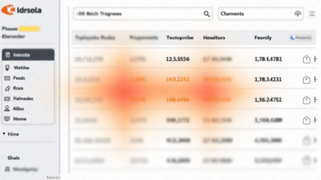
A heatmap is a graphical representation where colors highlight different levels of activity on a web page. Warmer colors (like red and yellow) show where people interact most, while cooler colors (blue and green) signal less activity. There are a few different types you’ll run into:
- Click maps: Show where users click most often.
- Scroll maps: Reveal how far down the page visitors scroll.
- Move maps: Track where users move their mouse or finger (especially handy for desktop pages).
I find click maps the most useful for primary actions, while scroll maps are a reliable way to make sure my page’s most important content actually gets seen.
Why Should I Care About Heatmaps?
Landing page layouts can look great in a mockup, but visitors don’t always use them the way I expect. Heatmaps reveal:
- What content or buttons people pay attention to (and which they ignore).
- Whether visitors scroll down to see important calls to action.
- Which links draw clicks, on purpose or by accident.
- Unexpected distractions or dead zones on the page.
These clues lead to changes that can really bump up conversions, lower bounce rates, and make everything on the page work a bit harder.
Setting Up and Using Heatmaps: A Beginner Friendly Approach
I remember the first time I set up a heatmap on my own site. It’s way less complicated than it sounds. Here’s how I usually get started if you want to try this out right away.
Choosing a Heatmap Tool
There are a bunch of handy tools out there, and most of them make the process pretty painless. These three are always worth checking out:
- Hotjar: Super easy setup with click, scroll, and move maps. Free and paid options.
- Crazy Egg: Lots of customization and good for small businesses.
- Microsoft Clarity: Totally free and great for setting up unlimited heatmaps.
You usually just register for an account, grab a tracking code, and drop it onto your website. The process takes only a few minutes, and the data starts rolling in pretty quickly.
Where to Place Heatmaps on Your Site
I like to start with pages that have the highest impact on my goals, usually main landing pages, high traffic blog posts, or sales pages. Avoid spreading yourself too thin with too many heatmaps at once. Focus on:
- Pages with traffic but low conversions.
- Newly launched campaigns.
- Key funnel steps, like opt-in or checkout pages.
How Long Should I Collect Data?
Sample size really matters with heatmaps. I usually let mine run for at least a week, or until I get at least 200-500 visits to the page. This gives me enough variety in user behavior to see reliable patterns without waiting forever to make improvements.
Extended data collection for high-traffic pages—or across different device types—can reveal surprising trends. Running heatmaps during special promotions or seasonal campaigns may also uncover patterns you won’t see at other times, helping you refine your strategy for maximum returns.
The Most Important Things to Look for in Heatmaps
Where Are Visitors Focusing?
The hottest areas of the map (usually in red or orange) show where attention naturally lands. I always check if this matches up with my main message or call to action. If people are fixated on something less important, like a decorative image or unrelated link, it’s a sign I should move or redesign elements for better focus.
Where Do People Click?
Click maps highlight both expected and surprise hotspots. Watch for these common scenarios:
- Lots of clicks on navigation links instead of the main CTA. People may be distracted.
- Clicks on non-clickable items (‘ghost links’), like images or headlines; they may be expecting something to happen.
- CTA buttons getting almost no clicks, which usually means they’re too hidden or not compelling.
How Far Down Do They Scroll?
Scroll maps sometimes show me that visitors never get close to the bottom of the page. If your main offer, form, or button is buried low and your scroll map looks icy blue past the halfway mark, it’s time to move it higher or cut the fluff.
Where Are Users Getting Stuck?
Look for ‘cold’ areas right before a sharp dropoff in engagement. These can reveal confusing sections or points of friction. Sometimes simple tweaks, like shortening a chunk of text or breaking up elements with white space, keep visitors moving toward the conversion point.
Best Practices for Heatmaps: Getting the Most Accurate Results
Everyone wants to get the juiciest insights from their heatmaps, and I’ve seen a few best practices for heatmaps that really help get things right:
- Run separate heatmaps for desktop and mobile: What works on one device often looks and feels totally different on the other.
- Combine heatmap data with other analytics: Use heatmaps with Google Analytics to spot ‘what’ and then jump into ‘why.’
- Use filters to focus on relevant traffic: Ignore bot and internal traffic so you’re only looking at real visitor behavior.
- Compare before and after changes: Anytime I make a tweak, I set a fresh heatmap to see if the needle moves.
Making these small tweaks ensures your findings are reliable and actionable. It’s also worth occasionally sharing results with colleagues or stakeholders. A new perspective can lead to creative solutions for stubborn conversion bottlenecks or low-visibility call-to-action sections.
How to Analyze Landing Pages with Heatmaps
Analyzing heatmaps is about spotting patterns, and, more importantly, finding opportunities to make things better. Here’s my process when I want straightforward improvements:
Step 1: Confirm Your Goal
Decide what you want visitors to do (sign up, buy, click a button) before you even open your heatmap. Every tweak should make that action easier.
Step 2: Identify Distractions
Are visitors clicking random images, links, or navigation instead of your main offer? Consider trimming unnecessary elements and making the path to your CTA super clear.
Step 3: Check Content Visibility
Scroll maps tell you if important info is too far down the page. If people drop off before your form or offer, move it up or make the top half more engaging to pull people downward.
Step 4: Test New Variations
Based on what your heatmap shows, change one thing at a time. Try button color, placement, text, or reducing distractions. Keep the tweaks simple and run a new heatmap to see if it works.
Step 5: Rinse and Repeat
Improving landing page performance with heatmaps isn’t a one-and-done job. The best results come from checking heatmaps often, applying fresh insights, and always being curious about what might work just a little bit better.
On top of those steps, it’s useful to compare your findings against industry benchmarks. If your call-to-action gets more clicks than average, you’re likely on the right track. If not, more adjustments could be in order.
Using Heatmaps for User Behavior Insights
I love that heatmaps aren’t just about fixing surface-level issues. They give me direct insights into what people want, where they get confused, and what motivates them to stick around longer.
Seeing the Real Customer Adventure
Heatmaps back up or challenge my assumptions about how people interact with a page. Sometimes I’m surprised to see users fixated on a section I thought was unimportant, or completely missing a button I thought was obvious. This helps me make smarter design changes instead of guessing.
Spotting Patterns by Audience Segment
Some heatmap tools show how different segments behave; for example, comparing new vs. returning visitors or different traffic sources. I’ve noticed, for example, that paid ad visitors often get involved very differently from social media referrals or email subscribers. Tailoring the design based on those findings can help boost conversion rates.
Usability Testing Made Simple
Heatmaps give me a quick way to test if design changes actually help real users. Traditional usability tests take tons of time, but heatmaps let me see effects much sooner and at scale. They became my go-to tool when updating copy, changing call-to-action placement, or trying fresh images.
Over time, these snapshots of actual user movement and clicks can reveal changing trends, letting you stay ahead of shifting audience preferences or device usage patterns. That kind of early insight can shape your page before costly problems pile up.
Landing Page Heatmap Case Studies
Jumping into a few landing page heatmap case studies really shows just how helpful these tools can be for performance tweaks. Here are a few that stand out in my experience.
Case Study 1: Moving CTA Buttons Up Boosts Signups
I worked with a client whose sign-up form was stuck near the bottom of the landing page. The scroll map showed only about 35% of visitors ever saw it. We tested moving the form above the fold. Instantly, the red hot click spots shifted higher, and the conversion rate jumped by 25% within two weeks.
Case Study 2: Reducing External Links Cuts Drop-Off
On my own landing page, I noticed lots of clicks on social media icons and navigation links, pulling traffic away from my main offer. By moving these down to the footer and simplifying the header, the main button became the hottest spot on the heatmap, and engagement went way up.
Case Study 3: Visuals That Distract
A SaaS company I worked with had a landing page with a large product image above the main CTA. The click map showed almost as many clicks on the static image as on the sign-up button. Replacing the image with a demo video thumbnail (with a clear play button) helped direct clicks where they wanted, and conversions bumped up by 18% the next month.
Other Notable Observations
- Bulleted lists get more attention than big wall of text paragraphs.
- People usually ignore elements that look like ads.
- Well labeled buttons get more clicks than generic ‘Learn More’ or ‘Submit.’
Real world case studies like these show that simple visual adjustments guided by heatmaps can make a measurable difference in how visitors behave and how many convert.
Practical Action Steps for Better Landing Page Performance
Your Step-by-Step Action Plan
- Pick your most important landing page. Install a heatmap tool (Hotjar, Clarity, or Crazy Egg are great choices for new users).
- Run the heatmap for at least a week, aiming for a decent sample size of real visitors.
- Look for main click areas, scroll drop offs, and confusing hotspots (like lots of clicks on images that don’t link anywhere).
- Make one small change: move a button, rewrite a headline, or remove a distraction.
- Re-run the heatmap after your change. Did behavior move in the right direction?
- Experiment, rinse, and repeat until you see real improvements in metrics like bounce rate, average time on page, and, most importantly, conversion rate.
Extra Tips for Continuous Improvement
- Get team feedback on heatmap findings; sometimes a fresh set of eyes spots things you missed.
- Use heatmap screenshots in monthly reports to track improvement over time.
- Never stop testing. Even a high performing page can often be tweaked for even better results.
If possible, coordinate your heatmap tests with A/B testing; tracking two or more versions of your landing page simultaneously can help you quickly confirm which tweaks have the biggest payoff. Gathering user feedback through surveys or quick polls can also add helpful context to your heatmap findings.
Common Questions and Troubleshooting Heatmaps
Are heatmaps accurate for every page?
Heatmaps work best on pages with steady traffic. Thin traffic can lead to misleading “hot” and “cold” spots. For best results, focus on your main landing pages or those with at least a couple hundred visitors per week.
Can I use heatmaps on mobile landing pages?
Yes, and you definitely should. User behavior can be totally different on mobile devices. Make sure your heatmap tool separates desktop and mobile data for a fair comparison.
What should I do if my heatmap shows low engagement everywhere?
- Check your tracking code; make sure it’s working properly.
- Revisit your offer and design. Is there a clear benefit for the user? Does your page load quickly, or is something causing people to bounce?
- Try simplifying the layout or moving high value sections higher on the page.
How do I decide which changes to make first?
I usually start with the lowest hanging fruit, like moving a call to action or removing distracting links. When in doubt, focus on getting main buttons and forms above the fold and trimming out anything that pulls visitors away from your main goal.
Remember to always track your metrics before and after each change. This lets you know which tweaks made a real difference and helps you build a stronger, data-driven page over time.
Making the Most of Heatmaps: What’s Next?
Improving landing page performance with heatmaps offers a practical way to improve conversion rates, user engagement, and even SEO indirectly (bounce rates matter there too). The key is to treat your landing pages as a work in progress, always learning from fresh data.
Your Playbook for Ongoing Improvements
- Set up heatmaps on all your core landing pages.
- Review the results each month, noting hotspots and cold spots.
- Apply one or two simple changes based on what you see.
- Document your tests and results; screenshots are great for this.
- Keep an eye on user experience and conversion rates. Adjust as you go.
Have you tried heatmaps on your site yet? Share your favorite findings or questions below; there are always more tricks to test and results to learn from!


2 Comments
I really enjoyed reading this post about using heatmaps to improve landing page performance! Your explanations made a fairly technical topic feel easy to understand, especially how you broke down the different types of heatmaps and their practical uses. I like how you emphasized not just collecting data but actually using it to make smarter design decisions—it’s such a valuable mindset for anyone managing a website. Have you found one type of heatmap (click, scroll, or move) to be consistently more insightful when optimizing conversions?
Thank you so much! I’m really glad you found the breakdown helpful. Each type of heatmap offers unique insights, but if I had to pick one that consistently helps with conversion optimization, I’d say scroll heatmaps tend to be the most revealing. They show exactly where users lose interest or miss key calls-to-action, which makes it easier to refine layout and content placement. That said, combining scroll data with click heatmaps usually gives the most complete picture for improving engagement and conversions.